I’ve been meaning to blog about this for 6+ months now. Since it’s a sunny Sunday morning in Seattle before I leave on a week’s vacation, I’m finally letting loose.
Here’s the bee in my summer bonnet (which has stung me enough times to write this post about it). For better or worse, I’ve been using Gmail as my primary email client for several years now (after being convinced by Adam Engst at TidBITs) and I’m about 90% happy with it. It has it’s share of quirks and bugs, but it also has awesome features like labels (not folders) and conversations (automatic thread tracking) that revolutionized how I manage email. And last fall they changed the main editing window to a new format that fixed several things that made me even happier with it.
Except for one. One design decision that has me scratching my head so hard each time I have to use it I’ve just about dug a rut above my right ear.
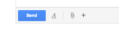
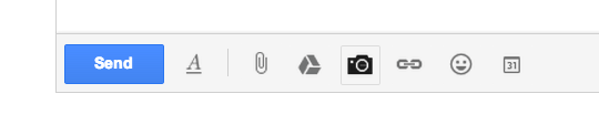
It takes just a few pictures to explain. First, here’s a shot of the toolbar that now appears at the bottom left corner of a GMail email editing window.

One thing I immediately liked about this change was the big blue Send button which is always in the same place (a big improvement over the previous interface where you often had to scroll to find it and could easily mistake it for another button).
And with just three other buttons, it does look wonderfully clean and “streamlined”, which is what I understand Google is trying to achieve across all it’s products.
But that’s where the rub meets the road. Because guess what those three buttons do?
The A Button
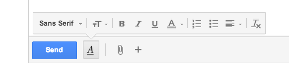
The first button is the “shortcut” for bringing up the text formatting toolbar. In other words, when you click it, you get this:

Great. Good job, Google. Now you just added an extra click EVERY TIME I WANT TO ADD TEXT FORMATTING TO AN EMAIL MESSAGE. Except if I want use a shortcut key. But—quick—who can remember the GMail shortcut keys for…
- A bulleted list?
- A numbered list?
- An indent?
What’s worse, there ARE no shortcut keys for changing text color or background color—something I frequently do in email to highlight important text.
Which means I end out clicking this button almost every email I write. The only justification I have been able dream up for this bizarre design decision is that Google wanted the editing toolbar to look the same on all devices, and the text formatting toolbar was too big to fit all on one line on a smartphone.
But why penalize everyone who uses Gmail 90% of the time on a giant monitor like I do? With all the other Javascript wizardry in Gmail, why not just detect the window size and auto-expand the toolbar whenever there’s enough room?
Okay, so that’s bad enough. But it gets worse.
The Paperclip Icon
The second button is, together with the Send button, the other thing Google got right here. It’s the attachment icon. One click to add an attachment to your email. Works the same way all the time. Thank you.
Only ironic as hell because now Gmail supports drag-n-drop attachments. Just pick a file in the Finder, drag it anywhere over the body of the message, and let go. So I can barely remember the last time I used this button.
The Plus Button
Now we finally reach the main subject of this rant. The third button, the plus button, is…what?

Usually the + button means you are going to add something. What would you add to an email message? An attachment? But wait, isn’t that what the paperclip icon right next to it is for??
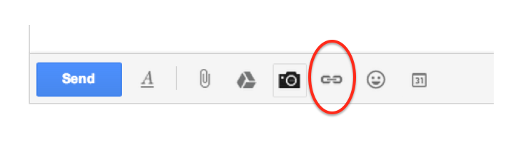
So try clicking the button and—whoa, this is really interesting—YOU CAN’T CLICK THE BUTTON! Because as soon as you hover over it, you get this:
The + button disappears and expands out into…FIVE MORE BUTTONS.
Seriously, Google: five more buttons? You want to force us to do a hover—not even a click—for FIVE MORE BUTTONS??
That might be fine if these were the “five buttons you’re never gonna use for the rest of your life”. In fact, four of these buttons just might meet that test:
- The Google Drive button is handy but you can also just cut-and-paste any Google Drive URL and Gmail already recognizes it as a Google Drive document.
- Same with Photos—much easier to just drag-n-drop it into the message.
- Emoticons DESERVE to be hidden away.
- The Calendar Invitation button lets you issue a calendar invite directly from your Gmail. Seems like a good idea, right? But: a) it only works with GCal; b) there’s already a way to issue an invite directly in GCal; and c) you always have to check your GCal calendar first anyway. So why would anyone do it here?
But—and this is a huge BUT— ONE of those five buttons absolutely DOES NOT meet that test.
The &^%$#@! Missing Link Icon
That’s right. The link icon.

The button you need every single time you want to turn email text into a link. Unless you remember the shortcut (quick—know that it is, right? Command+K for Mac users).
But keyboard shortcuts are not always a “shortcut”. To wit, my normal pattern is to go back and add links to an email message AFTER I’ve written it. When I’m doing my editing pass. WITH MY MOUSE. When my hands are NOT ON THE KEYBOARD. So it would be soooo easy to just CLICK AN ICON.
An icon that the Google designers, in all their infinite wisdom at a company that MAKES BILLIONS OF DOLLARS A YEAR OFF OF WEB LINKS, decided to hide behind another icon THAT YOU CAN’T ACTUALLY CLICK but instead have to HOVER JUST RIGHT so you can SEE THE REAL ICON THAT SHOULD HAVE BEEN ON THE &^#%$# TOOLBAR IN THE FIRST PLACE!!!!!
Okay. There. Rant done. I feel better already. In fact, so good that I think I’ll go take a week’s vacation.
And my dream is that when I get back, in the infinite magic of cloud computing, some Google designer would have realized (or seen 100,000 tweets suggesting that they realize) how simple it would be to put the link icon permanently on the toolbar right next to (or even in place of) the almost-never-used Attachment icon.
And the next time I open up GMail—voila—there it would be, fixed.
(I can dream, can’t I?)